Creating a View From Scratch
- Go to Structure > Views. (
/admin/structure/views) - Click the "Add new view" button.
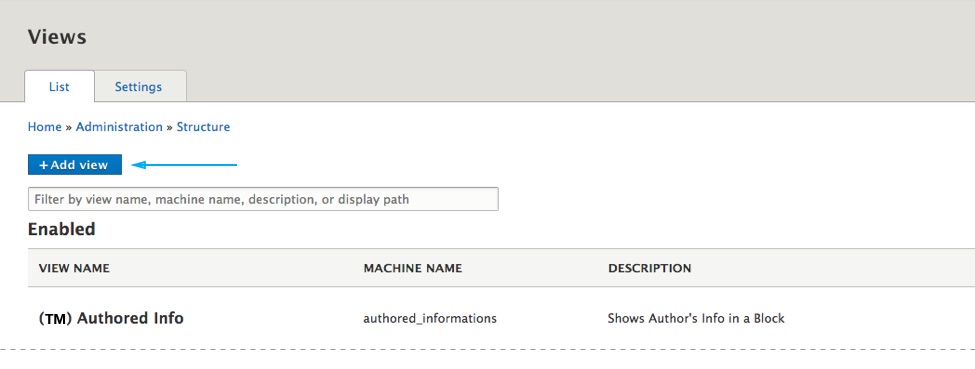
- Give the view a name and click the Save and edit button at the bottom of the page.
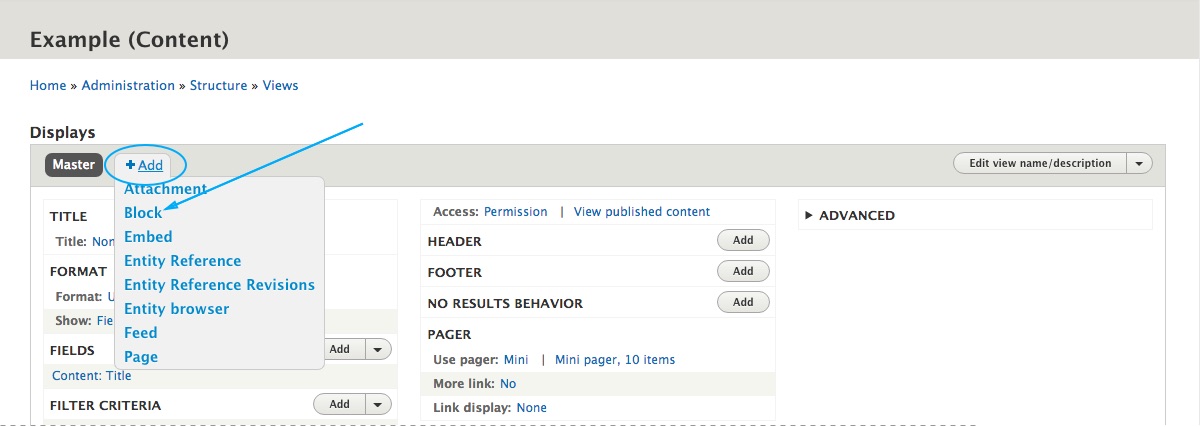
- Click on the Add button and from the dropdown menu choose Block.
Setting up the View
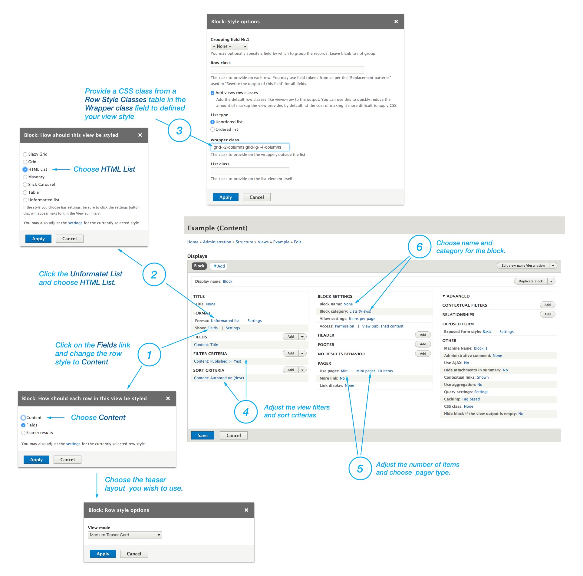
Click on the Fields link, change the row style to Content, and choose a teaser layout from the list. You can also use Fields in the View instead of Content. To do that, you have to follow the Teasers Style Guide and replace the text with field tokens from the view.
Click on the Unformatet List and change it to HTML List.
Enter a CSS class from a Row Style Classes in the Wrapper class field to defined the view row style.
Adjust the view filters and sort criterias.
Adjust the number of items and choose a pager type.
Choose name and category for the block.
Row style classes
Grids
| Class Name | Description |
|---|---|
| grid--2-columns | Creates two columns grid. |
| grid--3-columns | Creates three columns grid. |
| grid--4-columns | Creates four columns grid. |
Lists
| Class Name | Description |
|---|---|
| list | Creates classical list items. |
Responsive variations
You can also apply Bootstrap responsive variations on grid--N classes like this: grid-VARIATION--N-columns
Example:
grid--3-columns
grid-sm--3-columns
grid-md--3-columns
grid-lg--3-columns
grid-xl--3-columns
You can combine row classes inside the Wrapper field to transform view depending on the display width.
For example, if you use this three classes in the Wrapper field list grid-md--2-columns grid-xl--4-columns, you will produce a list of items on mobile devices, two columns grid on tablets and four columns grid on large displays.
Utility Classes
| Class Name | Description |
|---|---|
| no-gutters | Removes the gutter from the list. You can combine this class with any grid--N class. |
| equal-height | Combine this class with grid--N classes to make an equal height on a Teaser Cards in the grid. |
| items--separator--border | Creates bottom border on list items. |
| items--spacer--tiny | Decreases the top and bottom space between items. Useful in combination with list classes. |
| items--spacer--large | Increases the top and bottom space between items. Useful in combination with list classes. |