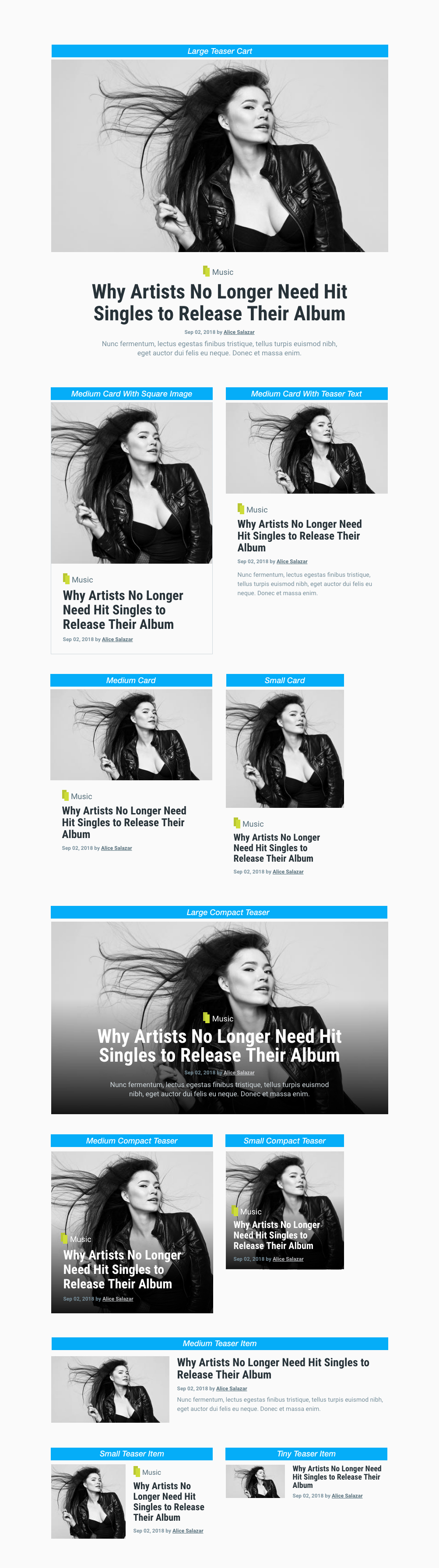
Teaser Style Guide
The HTML structure for all teaser styles is identical. Use the teaser HTML and add a modifier class to article element to define the teaser layout style.
<article class="teaser MODIFIER_CLASSES">
  ...
</article>
Teaser HTML
<article class="teaser">

    <!-- Teaser M=media -->
    <div class="teaser__media">
      <div class="image teaser__image">
        <a href="/url">
          <img src="teaser-image.jpg">
        </a>
      </div>
    </div>

    <!-- Teaser content -->
    <div class="teaser__content">
      <!-- Headline -->
      <header>
        <div class="channel teaser__channel">
          <i data-background data-color="#CCC"></i>
          <a href="/channel-url">Channel</a>
        </div>
        <h2 class="teaser__headline">
          <a href="/url">Title</a>
        </h2>
      </header>

      <!-- Authored info -->
      <footer class="teaser__authored">
        <span class="date">Date</span>
        <span class="author">by Author Name</span>
      </footer>

      <!-- Teaser text -->
      <div class="teaser__body">
        Teaser text
      </div>
    </div>

</article>
Class Modifiers
| Classes | Description |
|---|---|
| teaser--card | Defines teaser card layout |
| teaser--small-card | Defines Small Teaser Card teaser style |
| teaser--medium-card | Defines Medium Card and Medium Card With Teaser Text style |
| teaser--medium-card-square-image | Defines Medium Card With Square Image teaser style |
| teaser--large-card | Defines Large Card teaser style |
| teaser--compact | Defines compact teaser layout |
| teaser--small-compact | Defines Small Compact teaser style |
| teaser--medium-compact | Defines Medium Compact teaser style |
| teaser--large-compact | Defines Large Compact teaser style |
| teaser--item | Defines teaser item layout |
| teaser--tiny-item | Defines Tiny Item teaser style |
| teaser--small-item | Defines Small Item teaser style |
| teaser--medium-item | Defines Medium Item teaser style |
| Classes | Description |
|---|---|
| teaser--bordered | Adds a border on teaser article element |
Example usage
    <!-- Medium teaser card layout -->
    <article class="teaser teaser--card teaser--medium-card">
      ...
    </article>

    <!-- Small compact teaser layout -->
    <article class="teaser teaser--compact teaser--small-compact">
      ...
    </article>

    <!-- Medium item teaser layout -->
    <article class="teaser teaser--item teaser--medium-item">
      ...
    </article>

    <!-- Bordered Medium teaser card -->
    <article class="teaser teaser--card teaser--medium-card teaser--bordered">
      ...
    </article>
TheMAG data-background attribute
You might find yourself in a situation where you need to use inline style to dynamically set background image or color to a particular element in the view row. Since views don't allow usage of style attribute for security reasons, you can use TheMAG "data-background" attribute in combination with few additional attributes for this purpose.
Available attributes which you can use in combination with data-background
| Attribute | Description |
|---|---|
| data-src | Path to image |
| data-color | Color HEX or RBA/RGBA |
| data-width | Element width. Default is 100%. |
| data-height | Element height. |
Example usage
    <div data-background="image" data-src="image.jpg">
      ...
    </div>


    <div data-background data-color="#CCC">
      ...
    </div>


    <div data-background="image" data-src="image.jpg" data-height="60vh">
      ...
    </div>
Teaser Layouts